DOUBLE PAGE SPREAD
 My teacher gave me the following feedback:
1. She didn't understand how the image related to tattoos and that she mainly focused on the back of her head
2. I need to make the tattoos look more realistic on photoshop
3. The organisation is still lacking inspiration from real double page spreads
4. The title font is not appropriate
NEWSPAPER ADVERT
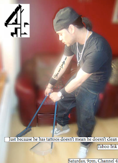 The feedback i was given are:
 1. The title needs to be more catchy
2. Still needs precise detail like the white boxes under the text should not have a black line
3. The tattoos need to look more realistic
4. Need to fix the text sizes
No comments:
Post a Comment