Friday, 8 April 2011
Thursday, 7 April 2011
Evaluation.
In my evaluation I am now answering the ancillaries question
I thought that my ancillaries related to my documentary because the message was to state that people are judged according to how they look. When generally peoples assumptions are wrong.
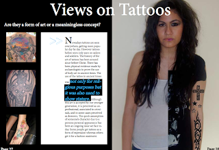
In the double page spread there is a girl half of her is tattooed and the other half is not this is portraying the idea that people are still the same with/without tattoos and no different to people without tattoos.
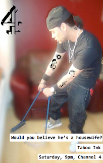
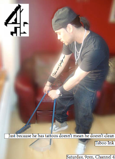
The newspaper advert is a man cleaning a house with tattoos, this highlights the idea that people judge those with tattoos negatively. Anyone can have tattoos, and they do not take away your personality.
Wednesday, 6 April 2011
Monday, 4 April 2011
Ancillaries Draft 4
DOUBLE PAGE SPREAD
 My feedback:
1. The image was a good concept but maybe each half of the image could be at the sides of the page
2. The images on the left do not communicate the perception of tattoos
3. The title is not eye catching and maybe it could relate to the focused image
NEWSPAPER ADVERT

My feedback:
1. Make the tattoos look more realistic through photoshop
2. Need to fix the font sizes to large, medium, small
Wednesday, 30 March 2011
Ancillaries Draft 3
DOUBLE PAGE SPREAD
1. She didn't understand how the image related to tattoos and that she mainly focused on the back of her head
2. I need to make the tattoos look more realistic on photoshop
3. The organisation is still lacking inspiration from real double page spreads
4. The title font is not appropriate
NEWSPAPER ADVERT
 The feedback i was given are:
 1. The title needs to be more catchy
2. Still needs precise detail like the white boxes under the text should not have a black line
3. The tattoos need to look more realistic
4. Need to fix the text sizes
Monday, 28 March 2011
Ancillaries Draft 2
DOUBLE PAGE SPREAD
 My teacher said that i needed to change a few things:
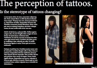
1. Change images as they make the article look like its about fashion
2. I need to change the organisation as it looks like it is boring to read
3. Too much text
4. I need to think about the text size
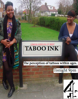
NEWSPAPER ADVERT

1. The image does not correspond to the idea of tattoos and makes the advert look like a streets documentary.
2. Must look more into channel 4 adverts and focus onto detail
Monday, 21 March 2011
Ancillaries Draft 1
DOUBLE PAGE SPREAD

My teacher told me that i had some faults about my newspaper advert
Overall level: 2
1. The images did not relate to the perception of tattoos
2. I should relate the title to communicate something about the documentary
3. I need to take my own images and that maybe i could have more pictures around the page
4. There needs to be a subtitle
5. must include page number/ magazine type etc
6. Should include drop capital at start
Over all level: 1/2
Overall mark: 3/4
NEWSPAPER ADVERT
1. To link the images to the perception of tattoos and said that the footballer has nothing to do with tattoos.
2. She didn't like that the word INK was in different colours
3. I need to take my own original images to link to the perception of tattoos
Overall level: 2
Overall mark: 5
Sunday, 20 March 2011
Evaluation.
The evaluation is starting to get together as my audience feedback and new technologies questions is now completed.
Today i started on the conventions questions
I found this question to be quite easy as i knew exactly what conventions i used which were a presenter and interviews
The challenge of conventions that i used was that we had a black female presenter instead of the normal white male/female
Today i started on the conventions questions
I found this question to be quite easy as i knew exactly what conventions i used which were a presenter and interviews
The challenge of conventions that i used was that we had a black female presenter instead of the normal white male/female
Monday, 14 March 2011
Start of Ancillaries
The start of ancillaries we had to plan different ideas for our double page spread and our advert:


Saturday, 12 March 2011
Documentary Draft 3
WWW:
- Wide variety of different interviews
- The content of what they interviewee said was interesting
EBI:
- Could get some public interviews
- Still too many interviews
- Too many images
Evaluation.
In the evaluation I'm currently doing the audience feedback question.
-I asked two people what they liked about the documentary and they said they thought that the title was a good idea as it was hand written on someones skin to make it look like a tattoo
-They thought that the visual was corresponding to the voiceover
Sometimes they got a bit confused on what the topic of the documentary was about. Whether it was about tattoos within ages or within genders.
Friday, 25 February 2011
Evaluation.
I have just started to answer the question of new technologies
This is difficult to answer because one of the new technologies we started using was indesign and at this moment i am not comfortable using it, so i'm was a bit conscious about having to talk about it in the evaluation.
This is difficult to answer because one of the new technologies we started using was indesign and at this moment i am not comfortable using it, so i'm was a bit conscious about having to talk about it in the evaluation.
Tuesday, 22 February 2011
Halfterm filming Vlog
- In the half term we ended up deciding to have a presenter because we thought it would be better communication for the audience.
- We also came into school so that we could do final editing.
Monday, 7 February 2011
Documentary Draft 2
Here is my documentary draft 2:
In our second draft of our documentary we received good feedback and things to do.
WWW:
In our second draft of our documentary we received good feedback and things to do.
WWW:
- The voice over corresponded well to the visuals
- Good beginning into the documentary
EBI:
- Need to fix the quality of the interviews as the lighting was pretty bad
- Too many interviews
- Need to focus more on sub topic
Tuesday, 1 February 2011
Monday, 10 January 2011
Subscribe to:
Comments (Atom)


